
Rhono Font—2018
CLIENT—
Self Initiated
MY ROLE—
Font Design
MORE INFO—
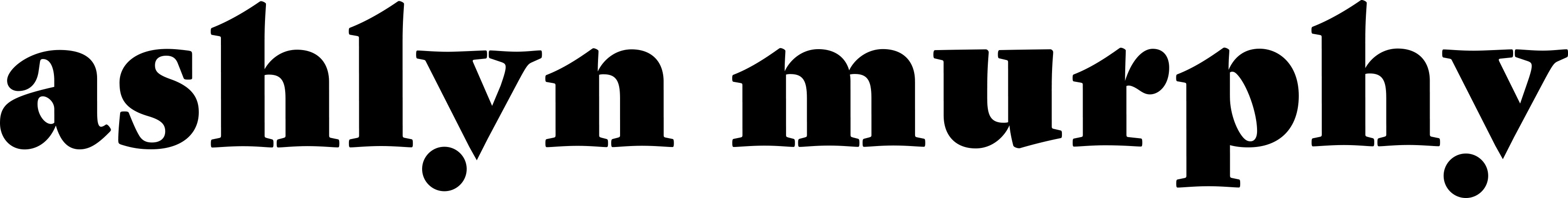
This font was inspired by vintage type design typically found on badges. Slab serifs were commonly used as display fonts on these items, but they were more symmetrical. I varied amongst those fonts by lowering the x-height on capitals and raising the x-height for lowercase letters. By doing this, it allows for longer counter spaces in letter forms and shorter stems. I also extended the crossbars on the uppercase letter forms to extend past their connecting stems. This project really showed me the extensive process designers go through to create typefaces. Designing this typeface came with many struggles and required acute attention to detail, but in the end I was pleased with the outcome and have a new found respect for font designers.